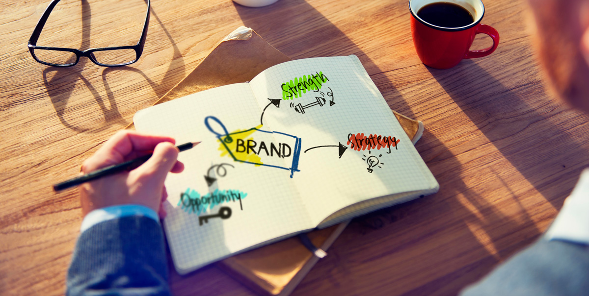
We all know that a picture can quickly communicate much more to a viewer than text can to a reader, but have you, in truth, considered how vital good logo design is for a business? Seeing a logo is often the first experience many people have with a company. It’s impossible to overstate its value as a foundational part of your branding. In mere moments, a logo can tell someone many things about your business — what you do, what your business persona is, and more.
With that in mind, nailing down a good design is of obvious importance. However, even the most memorable logos underwent much work before they were ready to debut. As you approach this design phase, what are the key elements your logo should include for its best chance at success?
1. Simplicity Isn’t Overrated
The best professional logo design is almost universally very simple, with as few elements as possible. From pure text like the Supreme logo to simple icons such as Apple’s iconic Macintosh, simplicity enables quick and effective communication about the brand. While creating more involved and visually complex logos can be tempting, these can confuse the eye and the mind at first glance. Emphasizing simplicity ensures clear communication.
2. Choose Colours with Deliberate Purpose
Colour is just as important to your message as the actual substance of the logo itself. What colours are a part of your brand identity? Be sure that the colours in your logo align with the colours you use in your other materials. Choosing a distinctive hue can create memorability. Look to the classic Coca-Cola red or the green of John Deere tractors as perfect examples of why bold colour choices have influence.
3. Adopt Unique Elements and Avoid Fads
Before designing a logo, look around at what others in your industry are doing, locally and farther afield. Don’t be a part of the common logo fads that plague start-ups and small businesses. While they may seem unique and identifiable, your logo can ultimately become lost in a sea of look-alikes. Aim for a distinctive look that helps you stand out from the crowd.
4. Select Typefaces with Care and Consideration
If you plan to include text in your logo rather than a pure graphic, invest time into researching the right font to use. The typeface you choose communicates just as much as the other choices you make for your logo — and it can impact how people feel about your brand. The classic “Comic Sans” font is a perfect example. While many people find it attractive, it instantly makes a logo seem amateurish. Don’t fall into this common trap.
Taking the First Steps Towards Excellent Logo Design
At Digital Lion, our broad base of experience enables us to provide a top-shelf service for businesses in Calgary. Our logo design services focus on effectively reaching the public and making your brand memorable. With in-depth knowledge of what works, what doesn’t, and what can endure beyond today’s fads, we’re ready to help you define your brand identity with strength. Explore more about how we can work together today.
Calgary-headquartered Digital Lion, with secondary locations in Edmonton and Ottawa, is a digital marketing and design agency built with a purpose and passion to partner with its clients and provide first-class Web Development, Graphic Design, Logo Design and Online Marketing services. We work with clients across Canada, as well as worldwide, and are focused on being environmentally friendly and giving back to charities that we are passionate about. Our mission is to “Design a Better World®.” Browse our website, follow our social media channels, and contact us anytime for more information on how we can customize a package that meets your needs and suits your style.
——————
